Better font rendering. This surprised me, but fonts look fuller and sharper.
Faster. Everything feels snappier, especially ordinary OS things like opening/moving windows.
The file manager does not regularly crash. Or crash at all.
So much more customization for the UI.
The panel (taskbar) can go anywhere, like in Windows’ olden days.
App and OS updates are handled by a single manager, making it simpler and quicker than Windows. Also, I choose when to install them.
A better bunch of built-in apps.
A better Mastodon app (Tuba) than anything on Windows (though not quite as good as some available on Mac).
Desklets, applets and extensions add a ton of optional convenience features.
There are aspects that aren’t as polished as Windows, I haven’t replaced all equivalent apps yet, and gaming is still not quite there, but at this point, the downsides of running Linux (I am still using Mint) are considerably less than when I first started tinkering with it. This pleases me.
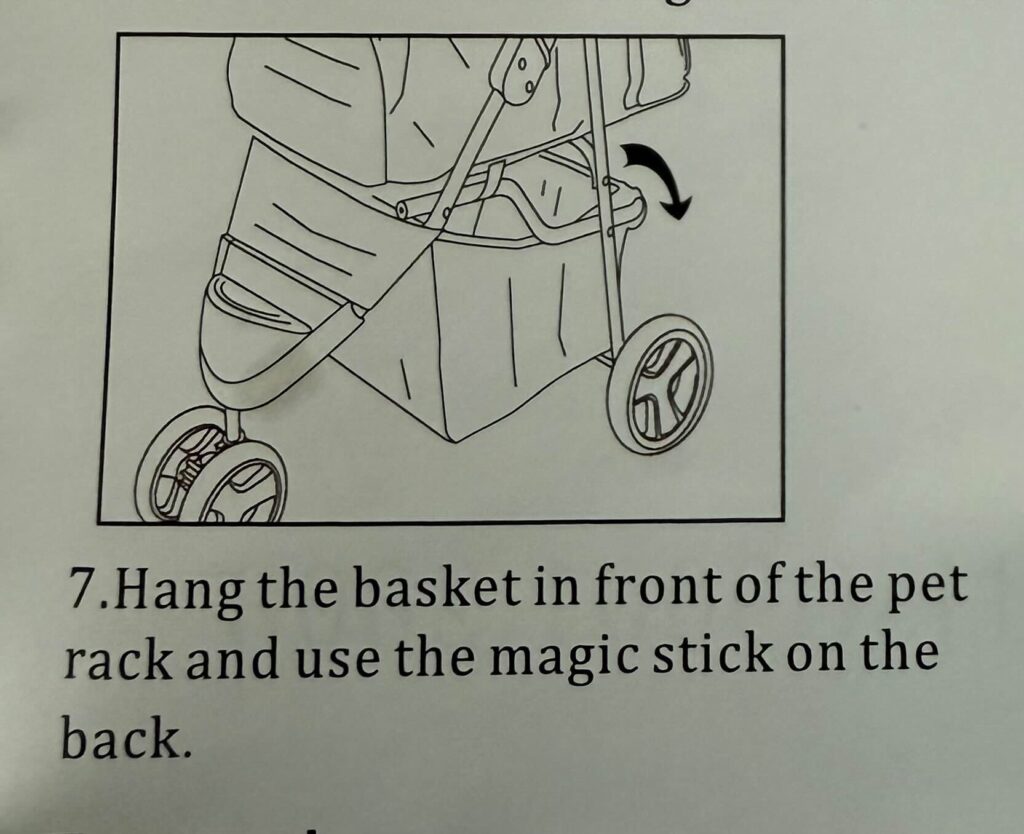
One of my online gaming pals got a pet carrier for his puppy so she can get out and about (she can’t go on-leash as she is not yet fully vaccinated). The carrier comes with this instruction:
It makes no other reference to the magic stick.
UPDATE, November 4, 2024: The magic stick has been identified. It is, in fact, Velcro.
I didn’t realize Blogstatic has an 8-day free trial, but it does! I have two days left on mine, and while I was initially enthused about it, because it seemed to tick so many boxes, I find it has some issues:
I don’t particularly like any of the few themes it offers
Customization is rather limited
I don’t want to go deep into the plumbing to modify a theme more to my liking
Limited image support (no lightbox or click-to-enlarge support that I can see, though it’s possible I’m just a big dummy and am not seeing these things)
Some of the editing interface is a bit confusing (which is something of a burn, when you consider how cluttered and messy WordPress’s editor is)
This means none of the following sites I’ve tried have really hit everything I want:
Pika
Bear
Scribbles
Posthaven
Blogstatic
Write As
Possibly others I’m forgetting
All of the above are perfectly fine (or even great) for posting text, but I also want to post photos and drawings, so image management is important, and they all fall short in some way when it comes to that. I am sad.
I still have a Ghost trial to experiment with (kinda pricey), and there are other sites I’ve probably overlooked. Doing searches for WordPress replacements yields a lot of stuff designed for SEO/commercial interests, not just little sites for hipster bloggers not looking to be a content farm.
I will report back with more on this hopeless quest soon™.
In the meantime, here is a cat blogging furiously.
UPDATE, the next day: The firmware update indeed showed no progress when I checked in the morning, so I unplugged the keyboard, plugged it back in and it appears to operate exactly as before--with one exception. Apparently Windows (or me, unwittingly) had changed the default for sound to one of my monitors, instead of the headphones. I corrected this and the knob is now adjusting system volume as before.

In other words, all the time I spent on this last night could have been managed in a few seconds. Technology is grand.
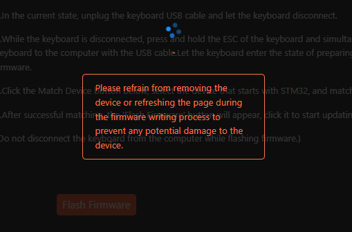
Sometime in the last few days I noticed the knob on my Keychron Q1 keyboard was no longer working. It normally lets me adjust system volume up or down, which is kind of handy. I can program it to do other things, too, but this was always good enough for me.
I was puzzled as to why the knob suddenly stopped working. It seemed to be OS-independent, but the rest of the keyboard worked fine. In fact, when I adjusted the knob, Windows would still report the volume control working–except it really wasn’t working, it was just showing as if it worked, while doing nothing.
I decided to check the keyboard mapping software to see if something was amiss and it said I could not program the knob because my firmware was too old. This didn’t really explain why it had worked fine before, but whatever. I decided to update the firmware.
The firmware process consistently failed at the same point. I did some internet sleuthing and finally came across a video from Matt Birchler–yes, the guy in my dream who I talked about squircles with–and watched his three-year-old video, which revealed a DFU reset button under the keyboard. This finally allowed the flashing process to start.
It has not finished. It has probably been 25 minutes since it started. It looks like this:
As you might guess, I am afraid to do anything to interrupt, but I also suspect it will look like this if I leave it overnight. But I’m going to do that, anyway.
For now, I have plugged my old CTRL keyboard back in, with its much firmer Halo keys, which I still find easier to type on, though they don’t have that silky smooth feel of the Keychron’s. It also has no knob. But this also means it has no knob that can fail and lead me down a rabbit hole that might lead to me bricking a rather expensive keyboard.
Last night I had a dream featuring Matt Birchler. I have never met Matt. He is a celebrity of sorts in the Apple tech scene, who has a YouTube channel (A Better Computer), a blog (Birchtree), a podcast (Comfort Zone) and probably half a dozen other projects. He writes articles for various tech sites. He also has an unrelated full-time job in UI/UX.
He is a busy guy.
I came across him via his blog and follow him on Mastodon, where much of the former Mac community from Twitter has migrated to.
One of his passions is UX and design (which works out well for him, because it’s also his job). In the dream, we are hanging out in a living room (?) somewhere and discussing design, as one does. Specifically, we are nodding in agreement over how circles provide more space for information over squircles (the rounded-off square icons you see everywhere on Apple devices these days). This is, of course, nonsense. Literally the opposite is true, but in the dream we were right, and the world was wrong.
Then I suggested we play something on “Game Center” on an Apple TV nearby and the dream ended, or at least my recollection of it did.
I’m not a big squircle fan, so I think the dream was just trying to accommodate that. Thanks, subconscious!
UPDATE, October 10, 2024: I manually updated after checking this morning and finding the phone had not updated on its own yet again. I kind of wished I'd waited, though, because I'm curious if the phone would have never updated again without me forcing it.
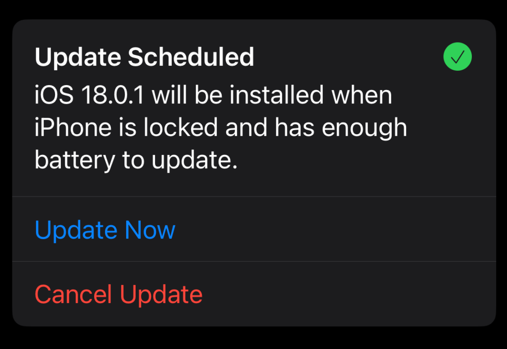
For the past few days, my iPhone 12 has been sending me notifications about an impending iOS update. Just make sure the phone is locked and has enough power, and it will happen automagically, it says (this is the state my phone is in when I plug it in to charge every night as I go to bed).
It never happens.
But like a scene from Groundhog Day, the notification keeps repeating, promising an update tonight.
Maybe tonight will be that night.
Update Scheduled. I believe you, iPhone1I don’t believe you at all, you dirty filthy liar!
In previous times, I’ve always ended up tapping Update Now, but this time I think I’m going to wait and see what happens if I don’t intervene. I’m feeling adventurous! Updates on the update soon™.
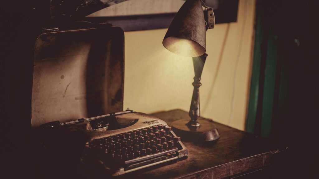
Another excuse to post an old-timey typewriter photo. Photo by Min An.
Short: I still haven’t found one.
Longer: The ones I’ve tried so far don’t have the right level of flexibility and customization that I want.
There are a lot of blogging platforms out there and they all excel at letting you put words onto the internet.
But I want more than words. I am a visual person, so I like including photos, images and things. Some blogging sites focus only on words, some allows images with limits, but very few seem to just let you freely mix both with abandon.
I want abandon.
Ghost probably comes the closest, but it’s $9/month (US, so closer to $12 per month for me) and that’s the basic plan, which doesn’t even let you use custom themes.
There’s Blogtastic, which sounds good on paper, but there’s no way to try it out other than paying, and I have enough doubts about performance, etc. to hesitate.
Beyond that is the world of static site generators, but I don’t want to host, configure and deal with backend nonsense. I do enough of that now. I just want to post words and pictures, to do so at reasonable cost and in a way that lets me relatively easily export my work if I decide to pull up stakes.
Summary: I continue to ponder. I am feeling an urge to start some kind of more focused writing project, though. Maybe I should just write a short story. 😛
It may not work for you, but it sure works for me!
Start Windows 11.
Open File Explorer.
Open a tab in File Explorer.
Repeat Step 3 until you have four or five tabs open.
Wait a short time.
Watch as File Explorer freezes, then crashes and restarts.
The good news is it usually restarts. If it doesn’t, press Win + R and enter explore.exe. This will restart File Explorer.
I will add this caveat: I run a lot of apps and background thingies, ranging from PowerToys to Discord, so who knows what dark magic is really making File Explorer upend itself, but whatever it is, it does not seem to like its new tabs being used.
Frank probably made his post in response, but it’s still kind of impressive he got it in when he did, given the article got over 40 pages of comments in about 24 hours.
Myself, I’m using List View now instead of the main Grid view. My issues reflect a lot of what others are saying:
Too much white space (and I see even less of it, since I subscribe and the design takes into account the now-unused ad space), which means a lot more scrolling and a lot less visible content.
Article headers are way too big, both font size and image.
The Grid view commits a huge faux pas by showing a large block of black with white text on it…when you select the Light theme. Not only is this illogical, it’s a legit accessibility issue. Light themes should be light.
Images in circles are small and not particularly easy to scan, which is overall minor.
I knew there would be griping a-plenty when the article about the redesign talked about updating to current design trends (which in many ways are bad and user-hostile). We’ll see where it ends up as they tweak, but history suggests it will be mostly as is and people will just get used to it.
Here’s the Grid view, as seen on the front page (click to see full-size):
That is a lot of dark for a light theme.
The headers on articles in Light view are still dark, too:
This is a 1780×1140 window.
Also, note that despite having my browser window set to 1780×1140 (not counting the address bar, etc.) I have to scroll just to start reading the article text. This seems suboptimal.
We’ll see how it evolves over the next few weeks. I’ll post an update if I remember!
Bonus irony points for this appearing in the link above:
Why would I not pay? It comes down to how I am visiting the site less these days, and the reason for that is a general steering toward clickbait-style content, opinion pieces of dubious value, and an increasing lack of awareness in the people reporting on tech and what is happening. There is also a distinct lack of a critical eye on companies that have long passed the point of getting the proverbial free pass.
EDIT to add more: The redesign they did a while back, just before Dieter Bohn left to join Google, was a horrible mess. Purple text. PURPLE TEXT. It’s still a mess, really, and it has one mode (on the front page)–dark. Too bad if that’s hard on your eyes, it’s hip. They also love embedding X stories and Instagram (which shows nothing if you are not logged into your Instagram account–you have one, right?) And they also repeat stories multiple times on the front page, which feels like hitting the reader on the head repeatedly with a Nerf hammer. Gentle, but annoying.
Plus, I’ve been engaged in The Culling for a few years now, and having one less site to read would be no big thing. Sorry, Verge!
But to be fair, The Verge does have good writing, as well, and they’ve occasionally experimented with the design of some stories in ways a site like Ars Technica (see below) never has. That’s good! It’s just not enough, overall.
EDIT, Part 2: I wanted to add that I am willing to pay for sites. I have subscribed to Ars Technica for several years now–they remove ads for paid subs, but even better, the design takes advantage of the ad-free space and everything flows better, even compared to using an ad blocker. But mainly, I support the site because they produce lots of articles I enjoy, the discussion is good (and the comments system isn’t atrocious, unlike The Verge’s).
This is enough icons to fill about six and a half rows. Eying it now, I’d say it covers about 20% of my very cool-looking Mars wallpaper–so it could be worse. Roughly five times worse, if my incredible math skills haven’t failed me. Still, it’s clear I’ve become lazy and turned the desktop into a dumping ground for all kinds of junk.
Or have I?
Well, yes. Yes, I have. But there’s also a practical reason. The desktop is always right there, so it’s easy to grab a file from it, rather than rooting around in File Explorer. But I could, of course, clean up all these files after I’ve made use of them (they are typically screenshots or other things I only need to keep handy in the moment, not forever and ever). This is where the lazy part comes in.
I’m going to clean them up right now. I will insert simulated time below and report the results.
…
…
Well, that took longer than expected, but the final result is:
A bunch of files moved to appropriate folders
A bunch of files deleted
Only two icons remain on the desktop, one of which is the Recycle Bin
File Explorer also crashed toward the end of the clean-up, possibly because I had the temerity to have about five tabs open.
In all, success! Now to get just as organized off the computer.