For some time I’ve had an informal rule on this blog to write a post per day or what works out to be a post per day by the end of the month (30 days = 30 posts), then I started going a bit overboard and making it two per day.
At the end of last month, I was 16 posts short of that two per day goal, but I took it upon myself as a challenge and cranked out 16 posts on the last day of the month. It was a little nutty, and kind of fun.
I have been even more derelict in posting this month, meaning I would need to add 24 new posts this month to come up to the magic number of 60.
And I am not doing that.
23 more posts to go!
But I will provide another amusing cat image for having read this far:
A little while back, I gave myself permission to post whatever I liked to this blog, with no filters:
Complaints? Sure! Though I try to minimize them.
Lists? I love lists.
Writing prompts? The sillier, the better. My inspiration.
Running updates? These are very skippable if you’re not me, though I started adding photos in the last year so at least there are pretty pictures as you scroll past.
Drawings and doodlings? When I have stuff to show, sure.
Self-referential posts about the blog like this one? Oh yes.
Recipes? No. Or not yet, anyway.
Things I like? Sometimes!
Reviews? I review every book I read, though my book reading cratered with the pandemic. I also review movies, but watch far fewer now, also a change since the pandemic. And sometimes I do not choose wisely, like when I thought watching Moonfall might be a good use of my time.
Other random stuff? I like random stuff.
All of this is a way of saying that I am again having a hard time coming up with stuff to write about, though there should be lots for me to ramble on about. I think I am afraid that anything I write might come out as a complaint because the world is, in many ways, kind of awful (See? I’m kind of doing it right now!) and it feels hard to avoid. I don’t want to just slap on a happy face and pretend everything is groovy, either.
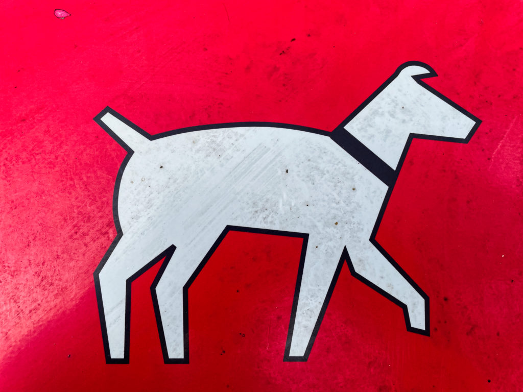
Usually this is where I end with a random cat, but for a change of pace, here is a random sign I photographed a few weeks back1It’s found on the bins in parks for disposing of dog poop. It looks somewhat cooler when seen in isolation :
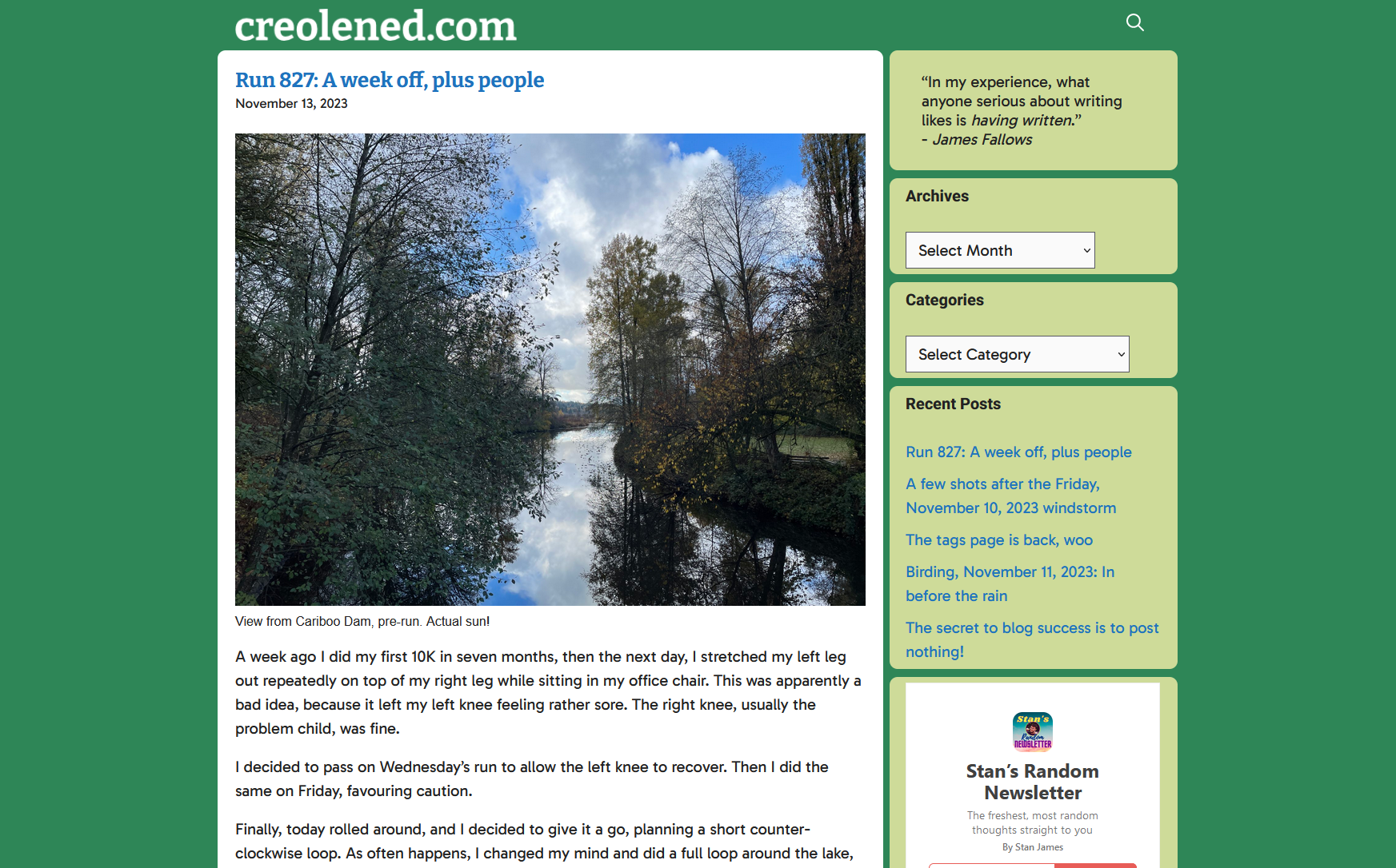
When I look at my current blog design (captured in screenshot form below for posterity, and for when it inevitably changes) it occurs to me that it is quite retro and I hadn’t consciously realized it. Today, I happened to look at someone else’s blog and it was very typical of what you see on most sites–clean white expanses, black text, little in the way of links or other clutter. Just the posts and that’s about it.
Conversely, my site currently:
Slaps you in the face with not one, but two bright colours, one that surrounds that traditional black text on white “standard” look.
Has a Categories list. Seriously, this is a standard part of WordPress, but I seldom ever come across it elsewhere.
An Archives dropdown. Also pretty rare and another built-in part of WordPress. This one is mostly for me, though. Also, easily seeing how many posts I’ve made per month is oddly satisfying.
The design isn’t cluttered, exactly, but it isn’t overly spacious, either. I feel most sites have a lot more white space. Mine is…cozier? Maybe it’s just more cramped.
And I’ve actually stripped away a lot of the stuff I used to have. The menus at the top are gone, the logo is now just text.
Maybe one day I’ll finish that redesign. For now, I’ll probably just continue to add bits back, content to have a blog that looks very 2005.
Or so it would seem, looking at the stats for this blog of mine.
I usually have 10–30 visitors to the site per day, which is fine because I don’t advertise or promote in any way, there’s no definable hook (it’s just me posting whatever, plus lots of jogging updates) and the design is nothing special.
But then, on November 9th (two days ago as I type this), I got over 400 visitors. I did not post that day. The day before I posted about my knee, which I suspect is not a huge draw, though I did post a link to a Charlie Stross talk that I found entertaining and on-point the day after.
But still, weird.
Anyway, to anyone who visited, please root around, you’re bound to find something at least mildly entertaining. Maybe I’ll throw up (!) my gigantic page of tags again, that’s always good fun.
I’m like Steve Martin in The Jerk1Yes, I am referencing a movie that came out in 1979. I am old. when the new phone book arrives2Remember phone books? I do, due to the aforementioned condition of being old.. So very excited!
Actually, I confess, I am not excited. The new features sound good, but I am concerned about further UI regressions. I see the Preview “hand iron” icon is still there, so that is not promising.
But I will maintain a positive outlook, because it feels like I’ve been crabby lately, and I don’t need to be crabby to drive engagement, because I don’t have engagement! I can be free to be positive, or thoughtful, or rambling, whatever I choose to be.
I have gotten off-track a bit.
Apparently, you can apply lightbox effects to images now. Let’s try that! I have checked the new Expand to click option for the image below, which should make it full-screen and all immersive up in the hizzzy.
Brunette River, going full fall
It seems to work. I’m not sure if I prefer this over the FooBox lightbox. Let’s try that one below and compare for science. Same image:
Brunette River, still going full fall
It looks like both pretty much give you the same larger image, but FooBox dims the rest of the browser window, retains the caption, and adds a border. On the other hand, the built-in lightbox plays a zippy animation when expanding the image to the larger size and feels all dynamic and modern.
On balance, I think I prefer the FooBox version, but I appreciate the new option1.
Just like the footnotes WordPress added previously, which I occasionally use now, especially if I want my posts to look like high-falutin’ essays. ↩︎
As mentioned somewhere in among the flurry of today’s posts, I have this informal rule on my blog, to post once per day. I later amended this to allow me to have a day or two slip by, post-free, as long as I ended up with an average of one post per day by the last day of the month.
Since instituting this, I have posted a lot more. Is this a good thing? Sometimes! Maybe even most of the time, if only just.
Then I thought, Why not more? More more more.
So I unofficially decided to try for two posts per day. This would seem twice as hard, but it is, in fact, much harder. Also, if you start falling behind, it becomes even tougher to catch up. Kind of like if you’re halfway through National Novel Writing Month and your lack of output means you need to write 3,000 words per day for the last two weeks. You just throw your hands up in the air and surrender. Or in 2023, you get ChatGPT to write the novel for you.
Anyway, when I got up today, I realized I would not hit that two post per day average this month, as I had written 46 posts, well short of the needed 62. It meant I’d have to spew out 16 more posts in a single day to hit my goal, which I’d never done before, nor even come close to doing before.
But I did it tonight! This is the 16th post I’ve put up today and the 62nd for the month, averaging two per day. Hooray for me! I will now celebrate by going to bed.
Also, I’m never doing this again1Quite possibly a big fat lie..
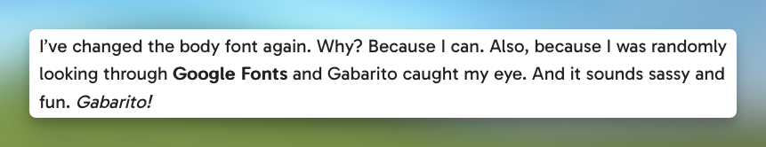
I’ve changed the body font again. Why? Because I can. Also, because I was randomly looking through Google Fonts and Gabarito caught my eye. And it sounds sassy and fun. Gabarito!
Anyway, this is what it looks like via screenshot, because I may change it again in a week as I continue to ponder the site’s design:
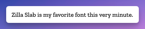
As I post this on September 27, 2023, the body font for my blog here is the Google font Zilla Slab. It may change soon. It will probably change soon. I can never find one I quite like. I am going through my Serif Phase now, though, so whatever comes next will likely be a serif font.
And yes, I know technically these are typefaces, and it’s only the specific variants that are called fonts, but that battle has long been lost, typography nerds. Sorry!
One day I may even be bold enough to tinker with the site again. Until then, I have billions more fonts to go through.
For when it gets changed, this is what Zilla Slab looks like:
UPDATE, September 30, 2023: New deficiencies/regressions are being added to a list at the bottom of the post as I encounter them.
UPDATE, November 15, 2023: WordPress 6.4 is out and at least one of the regressions has been addressed. The Open in new tab option for links is no longer buried, as seen in the screenshot below. Yay.
I try to avoid spending too much time complaining. Who wants to read some random dude’s complaints, after all? I mean, if they’re clever enough, sure. But this is not particularly clever, so I’ll be brief1In retrospect, this was a massive lie. Apologies for massively lying to you!.
WordPress 6.3 brought a few tweaks to the UI of the editor/block editor, resulting in inconsistency, adding extra steps to do the same tasks as before, and generally made the experience of doing stuff other than just basic text entry more cumbersome, with no discernible benefits that I can see as a trade-off.
There has been a lot of hate for the block editor, and rightly so2Not even a humble opinion, no sir.. It made it easy to drop in or move around blocks of “content”, but made it harder to actually just write, like in the olden days when blogs were all the rage.
I flirted with the classic editor plugin (5+ million installs) and have the classic editor block I can always use in a pinch, but my preference is to use software as intended, not install a bunch of hacks or workarounds to bend it to my will. The assumption is that the software will work the way I expect it to (mostly), and stay out of the way.
WordPress 6.3 does not stay out of the way. It blocks (ho ho) your way. It is anti-way.
None of what I’m about to detail is going to cause meteors to fall out of the sky or give someone a bad rash. These things don’t make WordPress unusable. But they make it clunkier, they add friction where there was no friction before, and they speak to a trend in design that suggests things may get worse still.
The three issues covered here:
Preview is now hidden behind a terrible, tiny, and meaningless icon.
If you want a caption on an image, you now have to specifically toggle captions on.
Setting a link to open in a new tab is now a multi-step, cumbersome process.
NOTE: I have added a pretty blue border around a lot of the shots below to make them stand out better. They are not this pretty in real life.
In order:
Preview’s new icon
Preview used to be a button that looked like this:
It is now this icon instead:
I believe it’s supposed to be an icon representing a laptop. Or maybe it’s an old-fashioned hand iron. Who knows? And if it’s a laptop, what does that have to do with Preview, anyway? And why is Preview now an icon, but Save draft and Publish aren’t? It’s not like there isn’t enough space. It’s inconsistent, vague and looks amateurish. And ugly.
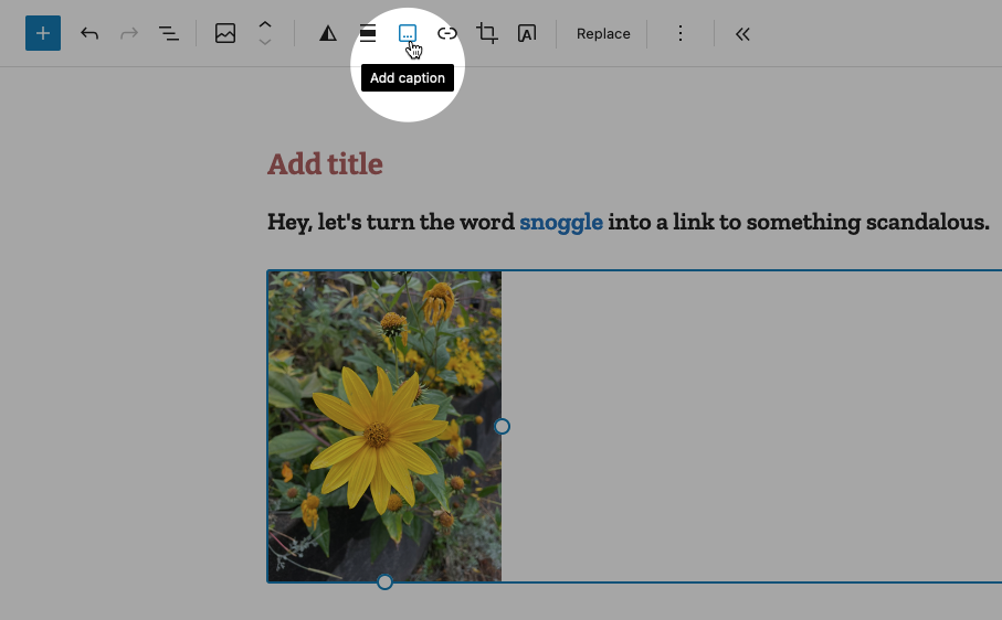
Caption an image
Back in the olden times of WordPress pre version 6.3, you would add a caption to a photo by simply typing it into the caption space below the image. If you left the caption space blank, the space would not render. Simple!
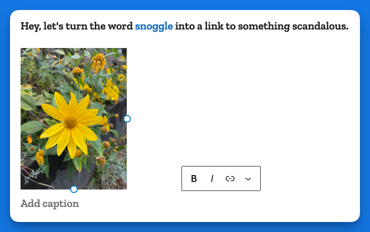
Now when you want to caption an image, you must specifically choose the option from the toolbar while the image is highlighted, like so:
This puts the caption area below the image:
In some crazy parallel universe where everything is opposite, this makes sense. Here, it just adds busywork to a task that literally had no steps to it, you just started typing!
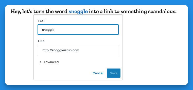
Making a link open in a new tab
In the previous version of WordPress, if you wanted to make a link open in a new tab, it was a checkbox item right there below the URL, like so:
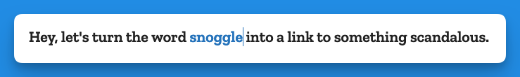
Now, when you go to add a link, you get this (in the example below I have highlighted the word snoggle for the link):
You get a blank text box, and nothing else. So let’s type something in there:
Now we have a link, Hooray!
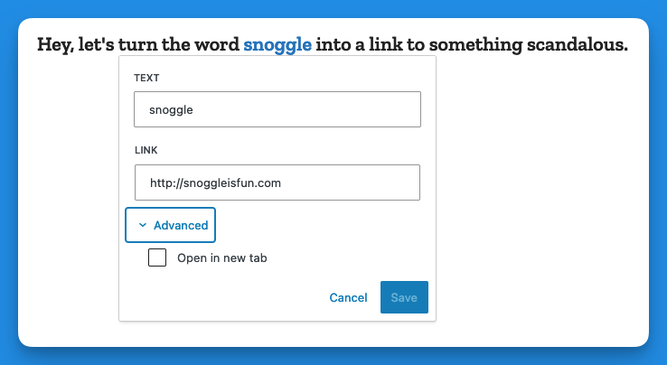
But how do we have the link open in a new tab?
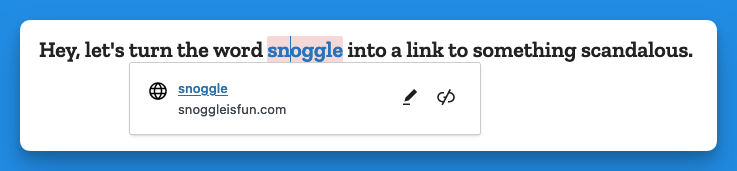
Well, you click on the link (you naughty person) and get this:
The two icons above are, respectively, Edit and Unlink. So you click Edit and you get this:
Then you click on > Advanced and get this:
That’s right, the Advanced menu gives you one option: Open in new tab.
I don’t have the proper vocabulary to express how cosmically dumb this is. If there was a universe-wide contest for really, really bad UI, this would finish in the top three.
Now, go back and add up the number of images I’ve used to illustrate the new way of opening a link in a new tab vs. the old way. Explain this madness. You can’t. There is no explanation. Perhaps it’s meant as a joke, a cruel joke on us pathetic humans.
Theses are only three obnoxious things I’ve found in WordPress 6.3 so far. There may be more. And I haven’t even listed the remaining issues with the block editor (or other parts of the UI). But I have written enough on this, and now it is time for chocolate.
Post-chocolate:
Additional 6.3 regressions
Previously when using the Preformatted block, if you copied the text from a Preformatted block, then pasted it elsewhere, it would remember the formatting (bold, etc.). It now strips this formatting. Even better, it does this inconsistently, so sometimes it will strip, and other times it won’t.
Previously, a selected image would show you its dimensions under Width and Height. This information is no longer present, though the Width and Height properties are still shown.
I got my monthly Jetpack report, dig it1Do cool kids say “dig” now? I want to be hip again. I want to be lit, or a banger, or something.:
That number of visitors translates to about 12 per day! A dozen people! That is double digits. Double digits is only one away from triple digits, and from there the sky’s the limit.
I want to thank the following for making this success possible:
Birds
Jogging (?)
Lists
Doodlings
That writing prompt I did about a barista going back in time to kill Hitler
For the past week or so, my brain has just not been cooperating with this blog. Giving myself permission to write about anything I want here was liberating, but even that freedom hasn’t been enough the past few days. I stare at the blinking cursor, and then I feel my mind drifting off, not to some great blog topic, but just weird little mundane things and thoughts. Nothing that I’d want to share in this space.
I do have a backup–a collection of blog ideas saved in Obsidian. But a lot of the topics I’ve jotted down no longer appeal. A lot of them are Apple kvetching, and I exceeded my quota on that at least 50 years ago.
So I end up doing these meta posts.
Oh, I just thought of a topic: Mastodon clients!
Mastodon is the only social media I use semi-regularly right now and I like it because:
No ads
No “reels” or other unavoidable short form videos
No algorithm–I only see the people/orgs I choose to follow
Not overwhelming. I like that I can easily keep up with what I’m following. It feels cozy and approachable.
I also don’t visit Mastodon on mobile. It’s strictly on my Mac or PC. On the Mac, I use the Mona app, which is a one-time purchase (hooray) and works well. On Windows, I use an alternate web version currently in alpha called Elk. It improves on the web interface and is pretty good, with only a few minor shortcomings. Still, I’d rather use a dedicated client, but all the Windows clients seem to have some flaw, the most common of which is they are ugly as butt. Windows apps don’t have to look ugly, but so many do. Every Mastodon client I’ve tried has been butt ugly. So I use Elk.
I don’t know why, exactly, the odds of a Mac app looking better than a Windows app is so high, but I suspect that it has something to do with the Mac GUI always being “good” and remaining fairly consistent over the years, with few dramatic changes. There’s a polished kind of consistency.
With Windows, well, just look at the GUI for different flavours:
Windows 1.0. I mean, yikes. But it was also 1985.
Windows 3.0. Pretty slick for the time, but crude by today’s standards.
Windows 95. Pretty decent, really.
Windows XP. Changed pretty much all UI elements in a way some liked, but others didn’t, feeling it was too “cartoony.”
Vista. Ignoring the initial quality of the OS, it again completely revamped the look, giving everything a pseudo-3D effect and having a glossy, reflective sheen to it.
Windows 8. Another complete change, flattening everything and subbing in garish colours and simplified icons.
Windows 10. A hybrid of 7 and 8 that reverses some of 8’s design.
Windows 11. A refinement of 10 that again changes the look of many elements, though perhaps not as dramatically as before.
Basically, if everyone followed the design language of Windows 11, apps would look pretty good. But a lot of apps seem to be weird hybrids of older versions of the OS and that’s when you get butts meeting the ugly.
Oh well. In the end, we’re seeing fewer native apps on both Windows and Mac as more devs use tools like Electron to make apps that look and feel the same (and don’t feel particularly native) on all platforms. I guess that’s the future.