Maybe the cloud isn’t all that. A few years ago I got a Synology NAS and it works pretty well. All of my photos from my phone are backed up effortlessly and I can access them from mobile using Synology apps. I can easily backup my camera photos, too, if I took the time to set it up. Right now I pay for the family plan for Microsoft 365, so Jeff and I can each get 1TB of OneDrive storage and access to the Microsoft Office apps.
But Word still drives me crazy, its permissions often create problems where none should exist, and there are free alternatives, like LibreOffice and OnlyOffice. My next renewal is in April, I’m thinking I might go with the NAS and open source apps instead. I just need to be prepared to provide tech support for the inevitable friction from making the move!
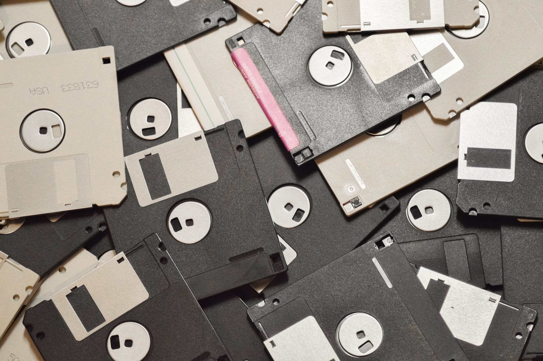
Basically, I am feeling this urge to pare back everything to The Olden Days of Computing, where everything was mostly local and the internet was for cats. I’m not saying I want to go back to floppy disks, but some things were better way back when.
For the past week or so, my brain has just not been cooperating with this blog. Giving myself permission to write about anything I want here was liberating, but even that freedom hasn’t been enough the past few days. I stare at the blinking cursor, and then I feel my mind drifting off, not to some great blog topic, but just weird little mundane things and thoughts. Nothing that I’d want to share in this space.
I do have a backup–a collection of blog ideas saved in Obsidian. But a lot of the topics I’ve jotted down no longer appeal. A lot of them are Apple kvetching, and I exceeded my quota on that at least 50 years ago.
So I end up doing these meta posts.
Oh, I just thought of a topic: Mastodon clients!
Mastodon is the only social media I use semi-regularly right now and I like it because:
No ads
No “reels” or other unavoidable short form videos
No algorithm–I only see the people/orgs I choose to follow
Not overwhelming. I like that I can easily keep up with what I’m following. It feels cozy and approachable.
I also don’t visit Mastodon on mobile. It’s strictly on my Mac or PC. On the Mac, I use the Mona app, which is a one-time purchase (hooray) and works well. On Windows, I use an alternate web version currently in alpha called Elk. It improves on the web interface and is pretty good, with only a few minor shortcomings. Still, I’d rather use a dedicated client, but all the Windows clients seem to have some flaw, the most common of which is they are ugly as butt. Windows apps don’t have to look ugly, but so many do. Every Mastodon client I’ve tried has been butt ugly. So I use Elk.
I don’t know why, exactly, the odds of a Mac app looking better than a Windows app is so high, but I suspect that it has something to do with the Mac GUI always being “good” and remaining fairly consistent over the years, with few dramatic changes. There’s a polished kind of consistency.
With Windows, well, just look at the GUI for different flavours:
Windows 1.0. I mean, yikes. But it was also 1985.
Windows 3.0. Pretty slick for the time, but crude by today’s standards.
Windows 95. Pretty decent, really.
Windows XP. Changed pretty much all UI elements in a way some liked, but others didn’t, feeling it was too “cartoony.”
Vista. Ignoring the initial quality of the OS, it again completely revamped the look, giving everything a pseudo-3D effect and having a glossy, reflective sheen to it.
Windows 8. Another complete change, flattening everything and subbing in garish colours and simplified icons.
Windows 10. A hybrid of 7 and 8 that reverses some of 8’s design.
Windows 11. A refinement of 10 that again changes the look of many elements, though perhaps not as dramatically as before.
Basically, if everyone followed the design language of Windows 11, apps would look pretty good. But a lot of apps seem to be weird hybrids of older versions of the OS and that’s when you get butts meeting the ugly.
Oh well. In the end, we’re seeing fewer native apps on both Windows and Mac as more devs use tools like Electron to make apps that look and feel the same (and don’t feel particularly native) on all platforms. I guess that’s the future.
Question: Do I find to-do apps helpful? Answer: Yes!
Question: Do I need to use two to-do apps? Answer: No!
Question: Why am I using two to-do apps? Answer: Because I am dumb?
I’ve been using TickTick since late 2021 and started using Microsoft To Do last year. To Do has the advantage of being completely free. TickTick does have a free version (I’ve been using it since fall 2023 after previously paying for a year).
Ideally, I just pick the one that works better for me and chuck the other. Easy-peasy!
My task list needs are not complex, so both work well to cover what I require. In the end, I think, as weird and superficial as it may seem, the best way to pick is aesthetics and UI.
Which app looks better?
To Do offers a variety of backgrounds per list, helping to make each list visually distinctive.
TickTick offers better-looking text, square checkboxes instead of circles, uses colour effectively, and lets you apply labels to tasks. The free version doesn’t let you use the calendar view (which I never ended up using), and seems to offer some limits on the mobile version, which I also don’t use.
So TickTick it is. I’ll try using just it for the next few weeks and see how it goes. If I switch again, I promise to feel both bad and dumb.
I read an article on Medium about Todoist in which the author lamented certain issues with the app. Todoist is one of the to-do apps I tested and ultimately dropped, though reliability was never an issue for me.
However, the comments on the article happened to mention another to-do app as an alternative, a new one I’d never heard of before called Twos. It’s developed by a guy named Parker and instead of a subscription for premium features, you just buy the ones you want for a flat fee (currently $2 US each).
Now, I’d settled on Microsoft To Do, but recently started using TickTick again. I do not need to test drive another to-do app. And yet here I am, doing just that!
I’ve given myself a week to evaluate it and see how it stacks up against the others. My initial impressions are favourable, though To Do still holds the crown as prettiest to-do app.
Thinking back over 2022, which was equal parts wonderful and horrible, what software did I use? Did I use any at all? Was all my computer-related stuff done inside a browser?
A lot of it was, yes. But here are apps I used on my Mac and PC regularly or semi-regularly in 2022.
Windows and Mac:
Obsidian. I’ve bounced around note-taking apps for a long time, trying to find one that could serve as a storehouse for all of my many random thoughts and lists, but everything I tried always had some flaw (quite often the “flaw” was being Apple-only, as I spend most of my desktop time in Windows). I tried Obsidian, and it had some immediate appeal: Free! Mac and PC compatible! Works on iPad*! Markdown! Local files, you don’t need the cloud! Links links links! In reality, there are issues with Obsidian, too. It only works on iPad if you’re willing to use iCloud as the intermediary. It gets very weird if you don’t, so I just use it on Mac and Windows, and don’t take notes on the iPad. But between an array of handy plugins and relative simplicity, I’ve grown comfortable using it and will stick with it, at least until something else shiny and new gets my interest.
TickTick and To Do. First, To Do is a terrible name for a to-do app. It’s too (ho ho) on the nose and hard to search for. Microsoft should have just kept calling it Wunderlist. In fact, they should have just kept Wunderlist instead of killing it and making To Do with the same team. That said, To Do is also free, and I’ve settled on it as my main checklist/GTD app. Runner-up is TickTick, which I used for a year, but I let the sub lapse in my great Culling of 2022. I’ve poked around it again recently, so this battle is not yet over.
Microsoft Word. Mostly because I had to, to send documents off to others to read. This may be the biggest use case of Word these days. I otherwise don’t use it for any writing. It’s fine.
Diarium. I gave up Day One (Apple-only, subscription required for all practical intents) for Diarium, which is a pay-once app and covers what I need for a journal. Like To Do, the name is terrible, but in this case because it sounds like a series of unpleasant trips to the bathroom.
Firefox. Still using good ol’ Firefox. I peek at Edge occasionally, but Microsoft seems intent on taking a good browser and larding it with cruft, ads and junk.
Affinity Photo 2 and Affinity Designer 2. This was the year I really dove into vector graphics with Designer, though I still have oodles to learn.
Luminar AI. For some photos, I like using the effects in Luminar to create reality that’s just a little heightened.
Bitwarden. To manage passwords and other security-related info.
Blender. Still learning this, will be using it more in 2023.
Visual Studio 2022. I can now remember that C# is case-sensitive!
Unity. I’m completing a game in 2023. Or else!
DaVinci Resolve. I have only edited one full video in this, but it’s for a game on Steam!
iA Writer. Largely superseded by Obsidian now, but still a good app with a nicely minimalist interface. The Windows version lags way behind the Mac version, though. It almost feels abandoned at this point.
Signal. I use this to chat with a few people. I love some of the weird/funny sticker packs (Roo!). I don’t love that I can’t correct my typos in sent messages.
Discord. To chat with the gaming crew I’ve known for 20+ (!) years.
Outlook ended up being my one-stop for email by year’s end. I use the web client, since the Windows version is in a weird place, caught between the old and new Outlook. It’s fine, but nothing special. I liked a lot of what HEY does, but finally felt I could no longer give money to a company run by a couple of techbro poopheads who elevate people like Elon Musk.
Steam. For the games I play. Epic Games Launcher for the copious free games they hand out. And sometimes for the games I play.
OneDrive. To manage files between the Mac, PC and iPad. I have a subscription to Microsoft 365, so get one terabyte of storage. I’m not sure if this counts as software on Windows, since it’s so tightly integrated with the OS. By comparison, it’s a little clunky on the Mac.
Windows-only:
Windows Media Player. The new version is pretty good. I use this to play my non-streaming music. For streaming on PC, I’ll use Cider, which is an Apple Music-like app, or, grudgingly (since it supports downloads) the crusted relic known as iTunes. It’s so bad. Apple is going to make Apple Music for Windows available in 2023, which will be an improvement, but a) Why didn’t they do this years ago? and b) The Apple Music app isn’t that great, either.
PowerToys. I use several power toys regularly, like Color Picker, File Explorer add-ons, Text Extractor and more. Very handy stuff.
Notepad. Yes! It’s surprising how useful it can be.
I use ShareX to grab screenshots in Windows. It’s free and works well. I take a lot of screenshots.
Weather. Yes, Windows’ built-in weather app. It’s pretty good! It’s had a bug where weather alerts display without text for a few months, though, so boo on that.
Clipboard History. Technically, this may not be an app, but it’s built-in, awesome and everyone should use it. Windows + V = handy!
Mac-only:
I spend less time on the Mac, but here are the Mac-specific apps I used this year:
Ulysses. I begrudgingly resubscribed, because it doesn’t have any good alternatives. Obsidian comes close, sort of, and I’m noodling around with Typora. But no other text editor seems designed first for fiction writers, rather than coders or technical writers. I mean, Scrivener does, but it’s a sprawling, ugly mess of an app in comparison.
CleanShot X. My app for taking Mac screenshots. I really like it, though I think the corner icons on its pop-in window were designed for 20-year-olds with eagle vision and could use a re-think.
Weather. Macs now have a built-in weather app and it’s perfectly decent. I actually prefer the aesthetics of the Windows app, which shows how far Windows has come since Steve Jobs accused all of Microsoft of having no taste.
Bartender. To keep the menu bar tidy.
Raycast. I’m only scratching its surface, but it’s a very nice Spotlight-on-steroids.
Pixelmator Pro. My go-to for editing photos on the Mac.
Tot. For quick notes in the menu bar.
CopyClip (clipboard viewer, though now replaced by Raycast)
For awhile now, the Windows 11 weather app (which I quite like–it covers all the basics and has a pleasing, subtle aesthetic) has been missing text for weather warnings or alerts. For example, right now I see this:
I mean, it’s nicely minimalist, but some text describing these dire-looking warnings would be handy!
(And yes, I used the Feedback app to report the issue, like a good interweb citizen.)
UPDATE, August 2, 2023: Microsoft changed its mind, and has continued to support SwiftKey with both bug fixes and new features. The reversal happened before the app would have been delisted.
I have had some kind of iOS device going back to the iPhone 4 in 2010. How has it already been 12 years? Time is crazy.
The default keyboard the iPhone uses has never felt right to me, and so early on I looked for alternatives when Apple allowed for third-party keyboards. I found one in SwiftKey, which looked nice, was usually good with autocorrect, rather than aggressively awful (why is it I had not seen the term “auto-corrupt” before today?) and didn’t require you to swap to a different keyboard screen for something as simple as using a question mark.
Microsoft bought SwiftKey in 2016, but this didn’t seem to affect the app itself, so I continued on my merry way with it.
Microsoft didn’t say why they are killing off only the iOS version, but it probably has to do with data collection and the limits Apple has in place for third-party keyboards.
I am sad.
For now, I’ll keep using it, as I don’t expect to get a new iPhone or iPad any time soon and the app will work fine in the meantime. After that, if I do get a new Apple iSomething, I’ll have to consider other options:
Default keyboard. It’s better now, but it still has a weird floaty feel I don’t like, and the keys seem a bit too small, even for my tiny, doll-like hands.
Gboard. Decent, but I’m trying to get away from Google, not run into its data-harvesting arms.
Grammarly. I guess they make a keyboard? Does it prompt you to get the Grammarly app if you make too many typos?
Others? Microsoft also owns Nuance, which itself owned Swype, so…who knows?
Meh. Meh, I say! This also reminds me that the utterly addictive iOS game Dungeon Raid got abandoned years ago. I played the heck out of that thing, then it stopped getting updated and is now gone forever (it was a paid app, not “freemium”). Given how much I played, I probably shouldn’t lament its disappearance.
One of the worst parts of Apple’s App Store success has been the move (encouraged heavily by Apple) toward Software as a Service (SaaS). This benefits both the developer and Apple because:
The developer gets a continuous revenue stream via ongoing subscription
Apple gets a continuous cut as it takes 30% of every subscription collected, in perpetuity (this can drop to 15% under some conditions)
This does not benefit the consumer, as they now might pay $50 per year in perpetuity for an app that once cost $50 total. In theory, the primary benefit to the consumer is ongoing, active development of the application, with the revenue stream providing stability the developers would lack if they sold their programs as a one-time purchase option.
I think that argument is largely bunk, and it made me stop using Ulysses for about a year and a half before I finally acquiesced and got a sub for it at a 25% off rate. But no more!
I have canceled or opted to not renew the software subscriptions I have, with a few exceptions.
A list! That is also a table! This shows the before and after apps, but not in that order.
Subscription-free replacement
Subscription-based app that was replaced
Diarium (journaling)
Day One
iA Writer, Scrivener (writing)
Ulysses
Affinity Photo (image editing)
Adobe Photoshop
Affinity Designer (vector image editing)
Adobe Illustrator
Obsidian (note-taking)
Craft
And the exceptions for which I still pay a subscription:
Microsoft 365. This is the family version, so it allows both me and my partner to access all the apps. While I do use Excel and Word sometimes, the main benefit of this is the 1 TB of OneDrive storage.
TickTick. I decided to try the paid version for a year, to see how it compares to going free. The calendar view, which is not available in the free version, turns out to be something I literally never use.
Todoist. I couldn’t decide between this and TickTick, so I am running both in tandem. It’s silly, but I’m a silly person. In six months I’ll pull the plug on at least one of these.
If you are software savvy™ you might note that some of the software that have subs can be used for free, albeit with some features disabled (Craft, Day One), while others, like Ulysses, cannot be used at all, apart from a brief trial period. Note also that none of the subscription apps are bad–they are all quite good, and some are industry standards (Photoshop, for example). And while it looks like it takes two apps to replace Ulysses, iA Writer and Scrivener have very different focuses and, unlike Ulysses, are cross-platform, which is another thing I’ve decided is critical to the software I use. All the replacement apps are available on Windows and macOS. In fact, they all have iOS versions, too.
If I end up having giant regrets over switching to the apps listed in the table above, I will make a follow-up post, complete with a well-chosen “I’m very remorseful” image. For now, I think this is the right call. I save money and also help support a model I prefer. Win-win!
Not actual obsidian, though it would be totally cool if I could find some way to make an igneous rock keep my life organized.
In this case, it’s the Obsidian note-taking app, which promises “a second brain for you, forever.” This sounds suspiciously like promising immortality, but I’ll settle for just keeping all of my notes in a single location, so my current and only brain has an easier time remembering to find things.
Why Obsidian. Well, let’s face it, it’s a new (to me) app and I like new toys, so I had to try it out. There’s a mobile version that can sync over iCloud Drive, allowing me to make notes from any device, which is convenient. So far this doesn’t sound much different from other note-taking apps like OneNote or Evernote, but Obsidian also uses a plain folder structure and text files, so everything is portable and accessible through simple apps like Notepad (Windows) or TextEdit (Mac). Because nothing is proprietary or stored in the cloud (unless you choose to put it there), your data is secure and yours alone. Obsidian also supports Markdown for quick formatting and has some features that promise to expand it beyond just a random collection of notes, such as:
Backlinking. Obsidian allows you to easily create links between notes, expanding what notes can do.
Plugins. Both core and community-made, extending the capabilities of the app.
Graph view. This visually shows relationships between notes.
Really, if I can just stick to Obsidian for all my note-taking, that would be a huge improvement over having to search for notes in OneNote, Ulysses, iA Writer, Drafts, the iOS Notes app, Notepad, Notepad++ and whatever else I’ve used over the years. None of these are bad programs–some of them I really enjoy using! But scattering my notes over all of them just makes it harder to find things, and stuff gets lost or forgotten. Or both. Lostgotten.
We’ll see how it goes, but I am cautiously optimistic that this is the beginning of some actual organization on my part and will usher in 2022: The Year of Really Fantastic Organization.
In this post I said I would make a decision on a task manager/to-do app in a week, then two weeks went by and here I am, sans decision.
Which perhaps underlines the need to start using one of these apps.
Previously, I had considered these options:
Things 3
TickTick
Microsoft to-Do
I’ve tinkered with the trial version of Things 3, and it’s very nice, even fun, but ultimately I feel it being limited to Apple devices only is a dealbreaker. I still do a lot of stuff on my PC and will continue to do so into the future. If they at least offered a web version, I’d probably still consider it. But alas.
To-Do offers good integration with Office 365 and collaboration, neither of which are of any use to me. As one reviewer noted, it’s nice-looking and the ability to set custom backgrounds for different tasks allows you to make them visually distinct, handy for at-a-glance recognition. But this is easily the most basic of the to-do apps (I mean, look at its name), and I feel it’s just a little too simple to make it worth committing to.
TickTick seems decent enough, but in my brief time with it I didn’t really warm up to its interface. There’s nothing wrong with it, I just don’t find it compelling. It’s hard to explain.
This leaves Todoist, which I had toyed with years ago, and was reminded of when it came up in several surveys of to-do software. It’s multiplatform, including a web version, and offers a lot of functionality even before you consider the subscription version. And for whatever reason, I spent more time poking around in it and testing stuff out.
So my tentative decision has been made: I’m going to try using Todoist. Starting next week (for real, I double dog swear) I am going to start scheduling stuff and see how it goes. I expect minimal drama and no more than one instance of curling up in a ball on the floor.