I say this as someone who has owned an iPad Pro since 2017.
When the iPad debuted in 2010, Steve Jobs pitched it as a “between” device that could do things a smartphone could, and things a desktop computer could–but it could do them in a more convenient form. The activities included:
Browsing web pages
Reading magazines and books
Watching video
All of these activities require minimal interaction, so they are suited to a touch-oriented device. The iPad’s larger display–yet still eminently portable design–makes it superior to a smartphone for viewing web pages or magazines, though with more responsive designs and larger phone screens, this use case is not quite as compelling as it once was. It’s still better for watching video in bed than a laptop or phone, I’d say.
Jobs only lived long enough to see one iteration of the iPad, called, cleverly1Given Apple’s often byzantine and arbitrary naming schemes, this is not sarcasm!, the iPad 2. It refined what was in the original, but otherwise changed nothing. It was just a better iPad.
That changed a bit in 2012 when Apple introduced the iPad Mini. It was, quite literally, a smaller version of the iPad. This didn’t change much, but it did mean that consumers now had two distinct choices when buying an iPad: regular size or smaller.
Apple then blew things up when they introduced the original iPad Pro in 2015. This had some refinements, but mostly it was bigger, going from a 9.7″ display to a 12.9″ one. Apple muddied the waters by later introducing a 9.7″ iPad Pro, which really wasn’t much better than the standard iPad Air available at the time (also a 9.7″ device). Apple “fixed” this by junking the Air (for a while) and bringing in a new base model iPad that stripped away things like the laminated display, but also dropped the price to a mere $299 (the original iPad sold for $499). The Pro models also supported a stylus, the Apple Pencil.
Does anything in the above paragraph look like a carefully-planned, long term strategy? Because it is not. It is Apple deciding one thing (“We need an upscale iPad so we can charge a premium price”) and then shuffling everything else around to make the line-up work. The early iPad Pros, apart from supporting Apple Pencil–an arbitrary limitation that was lifted a few years later, when Pencil support was added to all the myriad iPad models–didn’t really do anything that the base model couldn’t do. They looked a bit nicer, they sounded a bit better, they ran faster (not that you could really notice).
It was the Apple Pencil support that got me to buy that 10.5″ iPad Pro in 2017, then to move to the 12.9″ model when it was new in 2020 (I still use it today). It seemed like a way to get a Cintiq-like device, but (surprisingly, given Apple) for less than an actual Cintiq would cost. (This year’s iPad Pro models have reversed that, as Apple leaned much more into making the Pro model “premium”–even though it still can’t do anything more than a $300 iPad you can grab at your local Walmart.)
When I bought the 12.9″ iPad Pro in 2020, I got it from Apple directly and paid $1167. That’s pricey! The equivalent 2024 version is $1799. That’s silly.
But the price is not the main reason the iPad Pro is silly. You were probably wondering when I was going to get to this.
The silly part is: No one needs an iPad Pro. I don’t, you don’t, Apple doesn’t. Apple started the line to generate more revenue, and now they’ve jacked prices because Apple is in one of its greed-driven, “squeeze them for everything” phases (the last time was in the mid-90s). But in the drive for more money, Apple has boxed itself in, adding bits and pieces to iPadOS (which, let’s be serious, is just iOS with a different sticker on it), trying to make it work more like a laptop, with split screen, Stage Manager, a Files app (which started terrible and has stayed terrible since its introduction). But it is still marred by terrible memory management, arbitrary restrictions, a lack of utilities, and turning one or two click operations on a PC into a maze of steps, swipes and taps that sometimes just fail at the end, forcing you to start over.
It’s a mess and it’s a mess because Apple made a fundamental error in 2015 by introducing the iPad Pro. They got greedy, they made a mess, and in almost 10 years have failed to clean it up. WWDC 2024 is tomorrow, and Apple will probably make a few more token gestures to fixing iPadOS. But I don’t think they can.
The basic iPad experience is fine. Apple should refine what is there now to work better.
But here’s my advice for a company regularly valued at $2-3 trillion:
Keep the base iPad, Air and Mini. Lose the suffixes. They are all iPads now, differentiated only by size. If they insist on a cost-cutting base model, call it the iPad SE.
Kill the iPad Pro. Yep, kill it! No more iPad Pros! Continue to support existing models for 5–7 years.
Introduce a Mac tablet that runs a touch version of macOS. Include optional support to run a virtualized iPadOS.
Now you have a truly professional-calibre touch device. Yes, I’m basically asking Apple to re-invent the Surface Pro, but with Apple’s level of polish and precision.
The iPad Pro is just not going to get better, software-wise, without major surgery on the operating system that Apple will never commit to. So they shouldn’t. They should just give up and put out touch-based Macs instead.
Where: Reifel Bird Sanctuary, Shirley's Walk, South Arm Marshes Wildlife Management Area (Delta)
Weather: Sunny, 18-23°C
The Outing
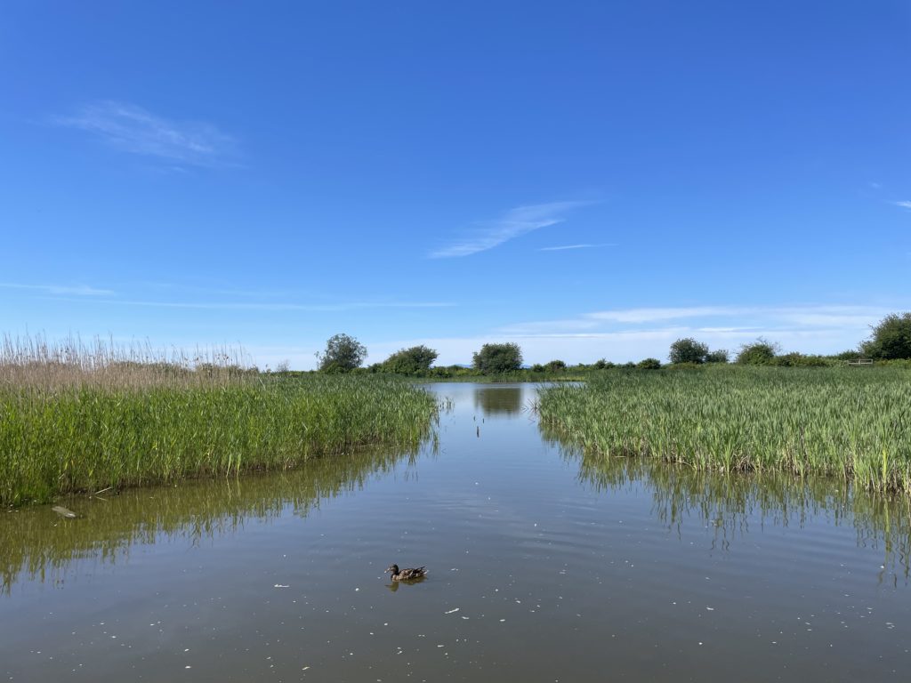
Reifel Bird Sanctuary
View looking toward the western dyke.
It was all Delta all the time with today’s abbreviated birding trek.
This was the first time this year that Reifel actually felt warm. Almost of the marshland is now green, thanks to a generous amount of rain through May. It was also apparent mono/tripod day, as it seemed like every other person was carrying a camera with a ludicrously large telephoto lens attached.
Several people told us about an oriole in the area, which would have been hard to miss, as it’s bright yellow, but alas, we did not see it. What we did see were a lot of scruffy wood ducks and mallards.
There was also a Sandhill crane up close and personal right near the entrance, then a Rufous hummingbird at the nearby feeders, so a good start.
Goose drama was nearly absent, save for one brief incident that took place in eerie silence. The lack of honking was pleasant, yet disturbing.
A pair of cranes later made their presence known to everyone in the sanctuary with a very loud call/answer routine. It turned out they were parents-to-be on a small island in the middle of one of the inner ponds. We later encountered the presumed dad on the trail and he seemed skittish, which is not the way cranes usually roll. We also witnessed an idiot literally running after him with her phone out, causing it to move briskly away. Nothing like coming to a bird sanctuary and chasing the birds around. Hopefully, some geese pooped on her car, which would probably cause irreparable damage.
We saw some cedar waxwings this time, but they were far off and up in a tree (imagine!), so our shots were not great. Maybe they will be more forthcoming next time.
One not-exactly-a-highlight was in the canal running alongside the East Dyke, where a bunch of unidentified fish, or possibly small sea monsters, were thrashing about all over. Several ducks hanging out were suitably disturbed and moved away from them. I have never seen this sort of display before, and the fish were doing this in probably a half dozen separate spots, if not more. Maybe there was something in the water.
Overall, it was rather quiet, save for the crazy fish and cranes, but we did get treated to yet more marsh wrens showing themselves and singing. The swallows were also all over the place, being shiny and zippy. I tried a few action shots, then decided it was better to just imagine the great shots that existed in my vivid imagination instead. Nic got some very nice swallow shots, though.
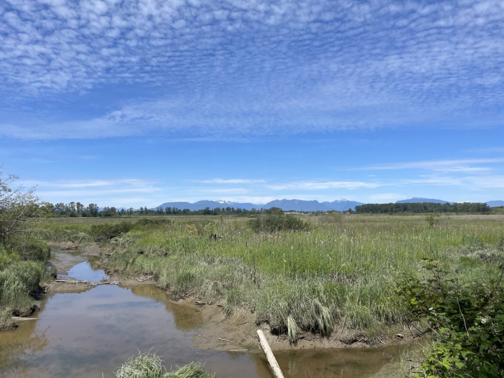
Shirley’s Walk
View of the marshland along Shirley’s Walk.
This is a trail in Delta that skirts the marshland and is about 1 km long. It had some nice view, nice benches, two sturdy footbridges, but no birds to be seen.
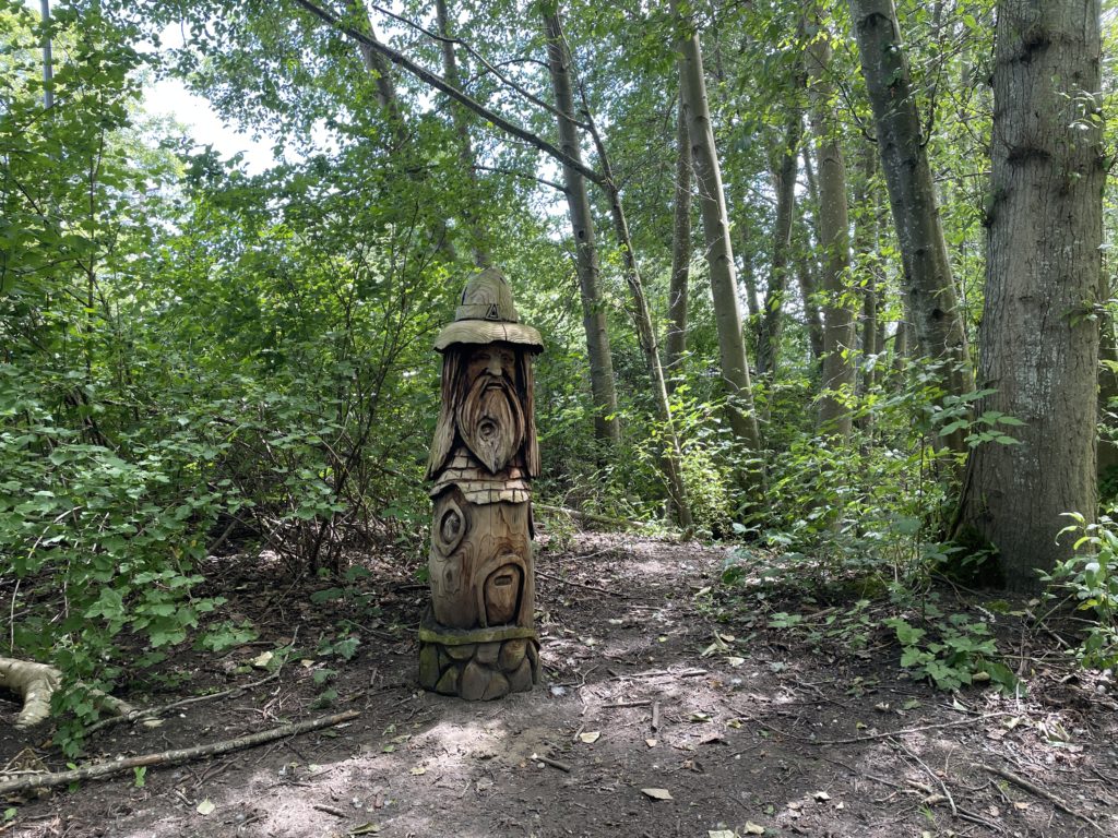
South Arm Marshes Wildlife Management Area
One of many carved wood figures alongside the trails.
This is a series of trails that go through woods, with a viewing tower at the end of one, and a view looking over the Fraser River toward Deas Island at the end of another. It was pleasant, and the shade was nice, though the abundant tree roots invoked mild PTSD. Has it really been eight years since I caught my foot on a tree root while jogging and came to a stop by having my body skid across the gravel? Yes, it has. A series of odd wood carvings featuring bearded men, owls and…things…also dotted the trails, giving it a unique vibe. Yes, unique, that’s it.
We did not climb the tower, as it was occupied by two other people, one of whom seemed to be delivering an extended monologue to the silent other.
We did see a few birds here, like a song sparrow, some bushtits, and a robin, which I got my usual fuzzy shots of.
And that was it!
The Shots
Soon™
The Birds (and other critters). Rare or rarely-seen birds highlighted in bold.
My goal today was simple: Run a short 2.5 km loop, completing the 5K I started on Wednesday.
I did this, but then:
Ignored the short loop part and just ran the full 2.5K, going clockwise.
I spotted myself 500 meters, then began tracking a 7K walk around the lake.
And obviously walked the 4 km back from the lake.
Conditions were pleasantly warm, around 20C, and humidity was high enough to stave off dry mouth. I started out with a spring 5:38/km pace, but knew that wouldn’t last. Fortunately, with only a 2.5 km run, it didn’t have to. My second km slipped to 5:48/km, and I ended with a perfectly cromulent average of 5:45/km. My BPM was slightly higher, likely due to a combo of the faster pace and higher temperature.
I spied several naughty cyclists on the trail–may they get double flats–and not one, but two mowers, each operating on either side of a footbridge along the Cottonwood Trail (which was very much littered with cottonwood dander). I am guessing the mowers would probably cause the bridge to collapse. The first mower was idling near the bridge, taking a break. The second was actively working, but saw me and paused. Prior to this, he was lifting the mower up very high, as if he wanted to mow the trees. I’m pretty sure you don’t mow trees.
My stamina is still pretty bad. I could really feel it toward the end of the run. Still, I plan on doing a full 5K on Monday. I’ll just pace myself. Slowly pace myself.
On the plus side, my training status went from Recovery to Maintaining to Productive over the combo of walks and the run. And as I type this, my knees seem OK. So maybe they are OK. Maybe.
Also, I hit a milestone of sorts–6,200 km tracked on runs!
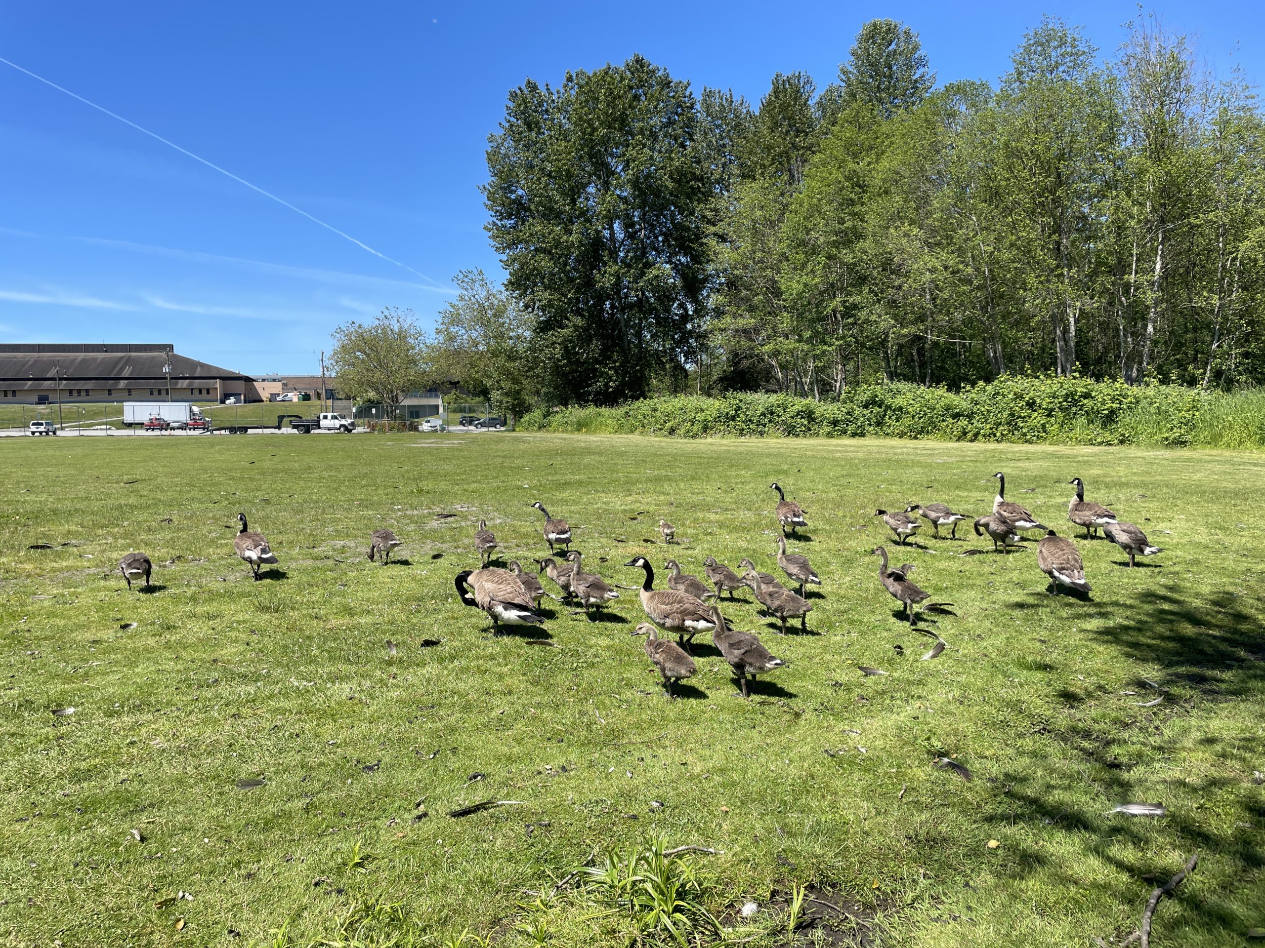
A bunch of adult geese and their surly teens emerged from Still Creek post-run, but didn’t seem to mind me, so I was able to get this photo:
Poopmonsters and teen poopmonsters, emerging from Still Creek
Stats:
Run 866
Average pace: 5:45/km
Training status: Maintaining
Location: Burnaby Lake (CW)
Start: 11:22 a.m.
Distance: 2.50 km
Time: 14:23
Weather: Sunny
Temp: 20-21°C
Humidity: 57-56%
Wind: light
BPM: 156
Weight: 169.1
Total distance to date: 6,200 km
Devices: Garmin Forerunner 255 Music, iPhone 12, AirPods (3rd generation)
Shoes: HOKA Speedgoat 5 (340/650/990 km)
With the site redesign mostly complete, I think I need a new logo, something that isn’t just literally the name of the site. Yes, I know it’s clean and efficient, but it’s also sterile and blah.
I still want something sleek and uncluttered. I will ponder.
When I tinkered around in Canva, I ended up with this:
It both does and doesn’t speak to me. It’s also full of hidden meaning that no one else would ever figure out.
But the actual logo will probably not feature a jar of pickles.
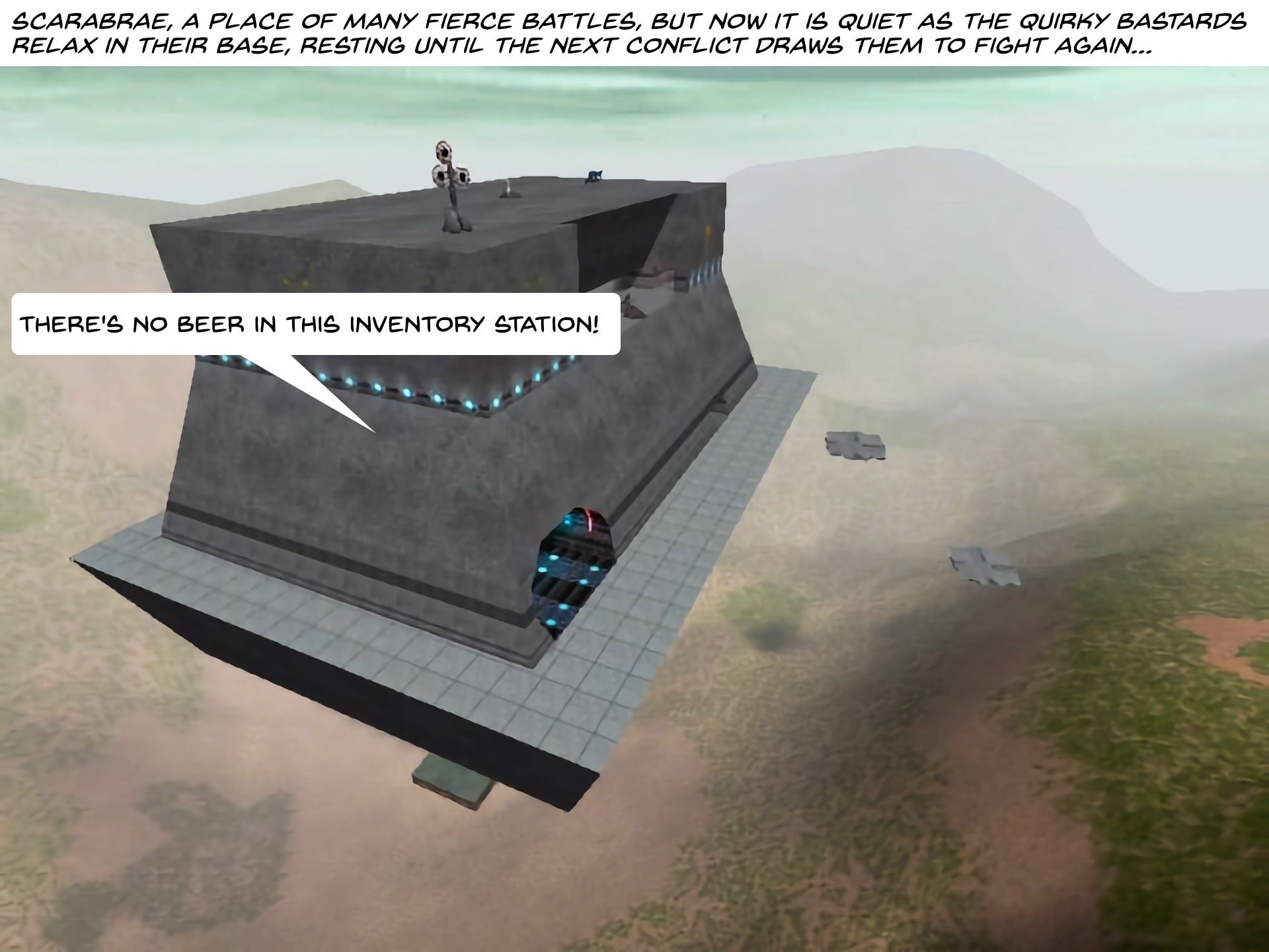
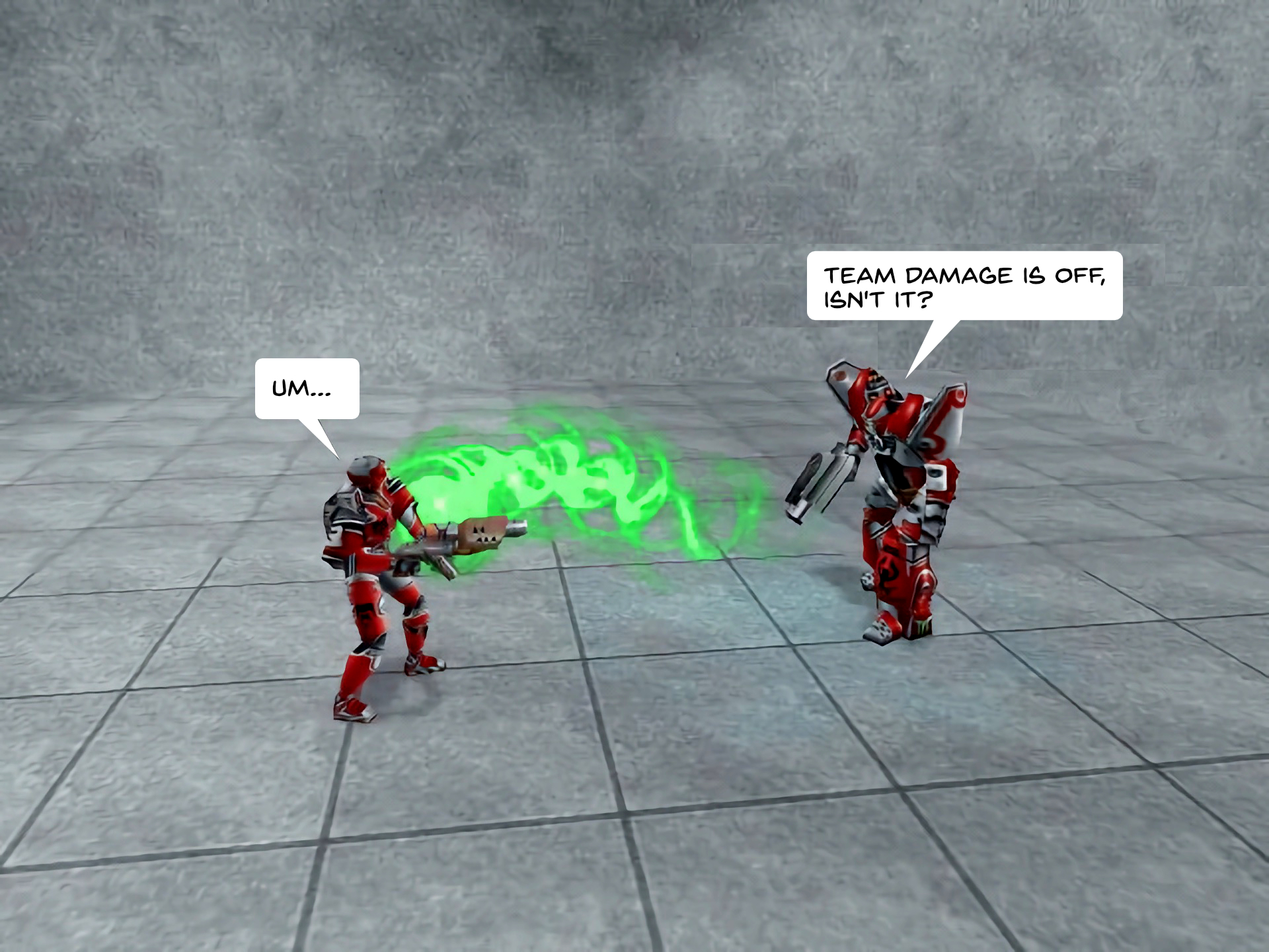
I finally finished going through Episode 1 of Angry Carrot vs. Quirky Bastards, reworking the comic to make it more palatable in the age of high-resolution monitors. I tried not to George Lucas it up by drastically changing the artwork and making this a Special Edition™, focusing more on preserving the original art, just making it smoother and more refined.
You can view the updated episode in the gallery below or on the AC vs. QB page linked above.
Issues with the HD version of Episode 1:
Continuity: The QBs are Blood Eagle (red), but in several panels the tower is shown as also being red, meaning under QB control, despite it being claimed by Angry Carrot. Whoops!
The line thickness on AC and minions varies a bit from panel to panel. I went back and redid a few, but the rest I declare just part of the charm.
The word balloons and text are sometimes a bit too big/spacious. This was a result of changing the font from Verdana to Back Issue BB, which have very different properties. In a few cases, I manually chopped down the size of the balloon and had to paint over the old balloon underneath to keep it from rudely poking through.
I dropped the outline on the balloons as it was too much work to easily replicate.
I adjusted the brightness of the shots to try to make them as even as possible, but a few are still too dark or too bright. Again, part of the charm!
On the plus side, the improvements:
Panels are now 1920×1440 instead of a tiny 640×480.
Redrawn Angry Carrot and minions have much more refined line work than the originals, with far fewer jaggies.
I forgot to give Angry Carrot arms in a few panels where he clearly should have had arms. This has been corrected.
The Back Issue BB font gives the episode more of a comic book look (this is a matter of taste, but I’m including it here).
I redid the first panel to make it match all other episodes, tweaking the fonts where necessary.
How I redid the episode:
I started by using Pixelmator Pro’s Super Resolution feature to preserve detail while increasing the images from 640×480 to 1920×1440.
Every panel featuring Angry Carrot and/or minions was brought into Procreate, where I retraced and recoloured over the original art. These were then exported as Photoshop (PSD) files to preserve layers.
I loaded all the upscaled art into Affinity Photo, then redid the text and word balloons, and made other minor tweaks to colours and other bits.
I saved these as Affinity Photo files to preserve the layers.
All panels were then batch exported as PNG, WEBP and JPG files. Although the WEBP files were smallest, they subtly toned down the colours of Angry Carrot in a way I didn’t like, so I went with the JPG versions.
Whoops, I swear I didn’t mean to go another two weeks between runs again. But I also didn’t expect to develop FOK1Fear Of Knees. I am now paranoid about my knees giving up, giving in and giving out. It has made me afraid to run at all.
But today, with the weather being nice again (finally), I decided to get out there and…do half of a 5K. If it went well, I’d do the second half on Friday, then resume full 5K runs on Monday.
I think it went well.
My pace was off, which is no surprise. I have done so little running in the last few months that I have lost my form, stamina and sense of direction. Fortunately, there are signs to help with the latter.
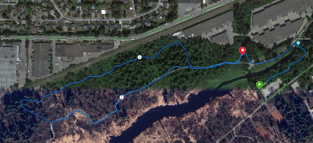
My route began at the Jiffy John for reasons best left unstated, then I followed the Spruce and Conifer Loops, turned back after rejoining the main trail and ended my run right near the bridge at Silver Creek–just about exactly what I was hoping for. This had the secret bonus of little overlap on the trail, despite how short the run was (see map below, which makes it look like half the area is dead because they obviously stitched together satellite data from different seasons).
Only a smidgen of overlap during the last 0.25 km
I ran in my Speedgoats, which are probably nearing time for replacement. Last Friday I snapped one of the laces, so took laces from my old Brooks Revels and used them. They were fine, even if they aren’t colour-coordinated with the shoes. I didn’t have anyone scream at me, “You fashion monster!”
Speaking of colour-coordination, I saw a guy running on the river trail. He was passing by me from the other direction and his t-shirt was utterly soaked in sweat. Kids, don’t let runners wear cotton when jogging!
The weather was nice, around 14C, with a mix of sun and some high cloud. I only encountered a few people and my BPM of 153 was fine, though my average pace of 5:50/km was a bit slow. That should improve as long as the knees allow it.
We’ll see how the back-half of the 5K goes on Friday.
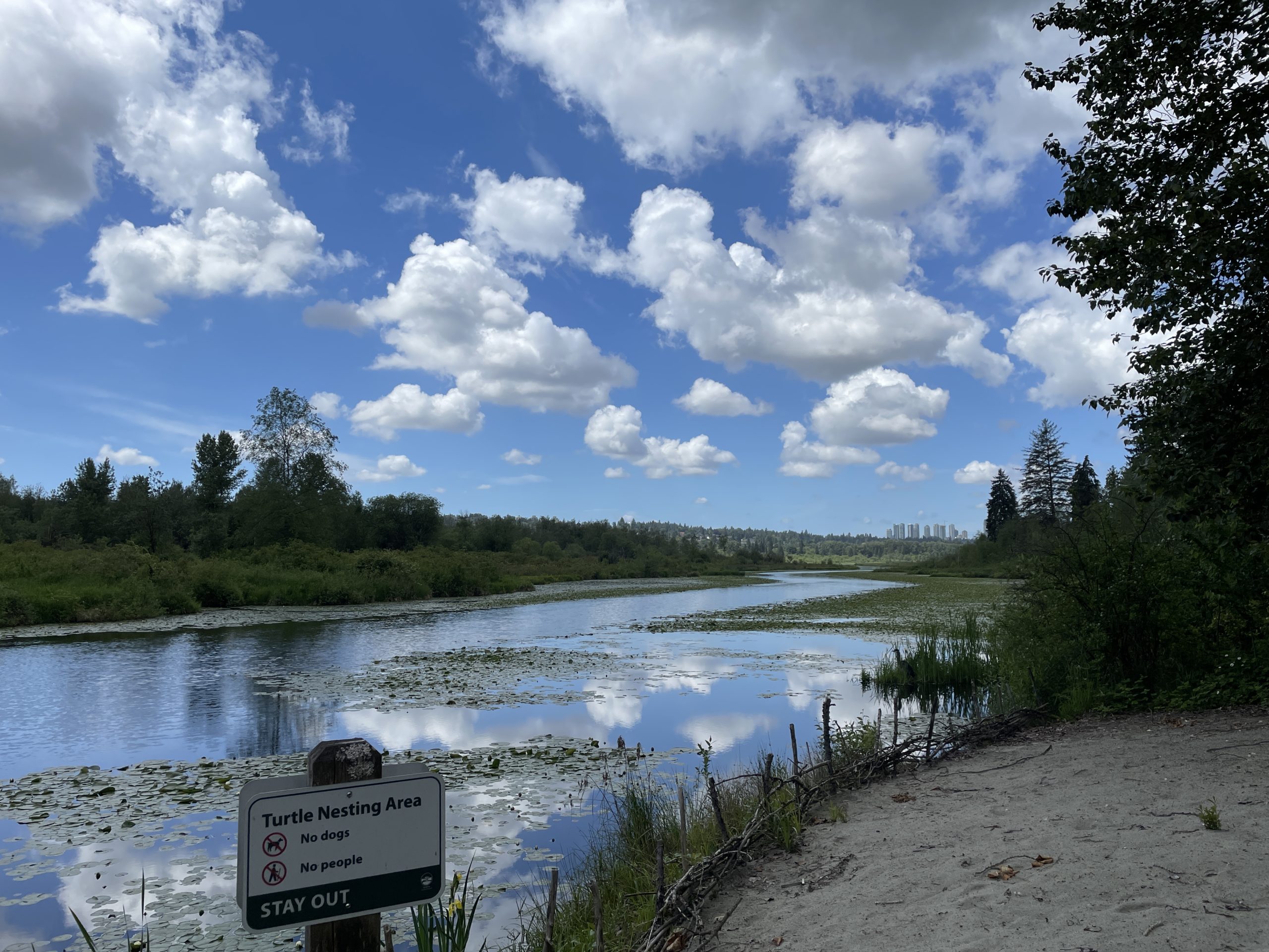
Turtle nesting area, post-run
Stats:
Run 865
Average pace: 5:50/km
Training status: Recovery
Location: Burnaby Lake (CCW, short loop)
Start: 11:33 a.m.
Distance: 2.51 km
Time: 14:38
Weather: Sun and high cloud
Temp: 14°C
Humidity: 65%
Wind: light
BPM: 153
Weight: 168.5
Total distance to date: 6197.5 km
Devices: Garmin Forerunner 255 Music, iPhone 12, AirPods (3rd generation)
Shoes: HOKA Speedgoat 5 (337.5/634/971.5 km)
After tending to some caching devilry, I seem to have gotten my site back up and mostly functional. It is still in flux, but for now the changes are such:
No more colour! Well, very little colour, but it’s mostly a sea of light gray. This will get tweaked.
The broad layout of content/sidebar remains. This, too, will get tweaked further.
While the layout is pretty much the same, the mono-colour means all the fancy rounded edges have been obliterated. I kind of miss them. I will ponder.
Archives and Categories have been demoted and Recent Posts removed.
Font Resizer is gone, as are the thumbnails for various links.
The links are now in a tidy little list, using Font Awesome icons with a li’l bit of colour (except for the Mastodon elephant, because there’s no non-political FA icon that is not political, and I couldn’t get the FA Mastodon logo to render for reasons).
Typography is unchanged (for now).
The logo has been made bigger and centred (and given a bit more space between it and the content).
With everything at least working, I will spend some time contemplating what I like and what I will change before diving in and probably wrecking everything again. Excelsior!